I think the greatest measure of a site design is if you'll read it yourself. After struggling with the previous theme, I decided that it wasn't worth the trouble it was causing me to read it (and if I won't read it, I'm sure someone else wouldn't read it either) so I rummaged around the Wordpress site, and found this theme. Yeah, it looks like a lot of the other blog themes out there, and maybe the little coffee cups in the sidebar are over the top, but I like it, and more importantly, I can read it.
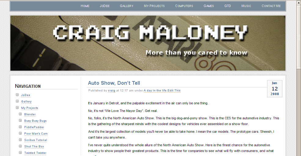
Here's an A-B compare, if you're interested:
Before:
After:
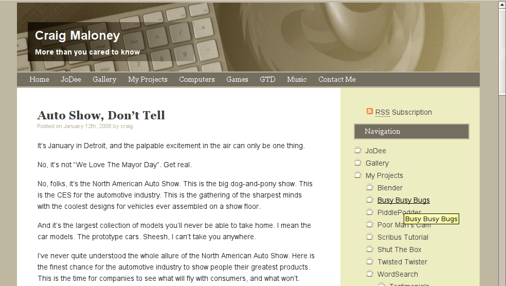
Notice the difference? Bigger font, more contrast. Soothing beige colors. The serene dance between man and keyboard, captured at a moment in time.
OK maybe it's not THAT serene, but you get the idea.
Comments are always welcome, both good and bad. I'm especially interested in what the design geeks out there might say about it.